Selected work / Paramount Business Jets Charter
Paramount Business Jets Charter
A clearer first step toward a private jet charter.
- Role
- UX/UI Designer
- Project
- Client project · Responsive web form
The problem
Where clarity was needed.
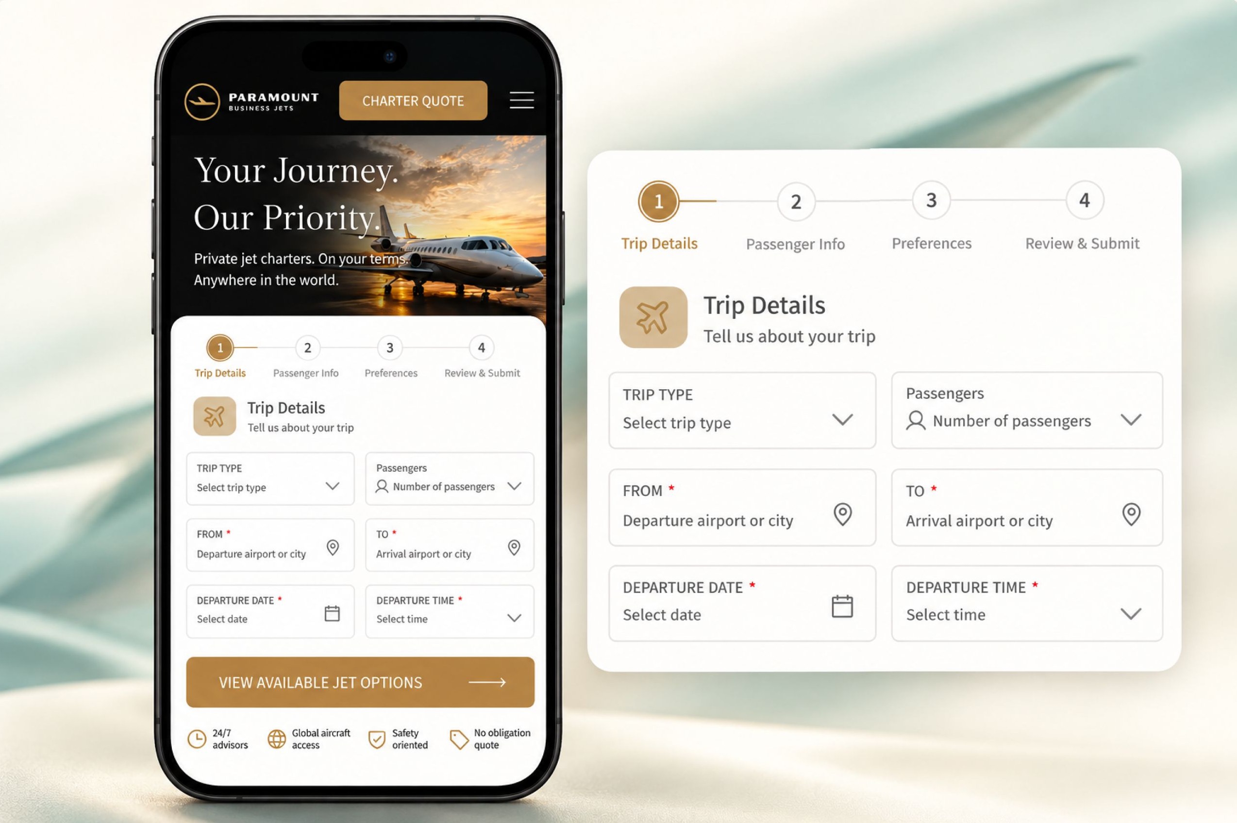
Requesting a charter starts with practical details: where you’re going, when you’re leaving, and who’s traveling. The original mobile form collected those details but offered little visibility into the rest of the request.
What informed the redesign
I redesigned the experience to make the fields easier to understand and show travelers what comes next, while preserving Paramount’s black-and-gold identity.
- travelers could not see the full request before they began
- field labels did not clearly explain what information was needed
- the form did not separate the request into a clear sequence
Four decisions that shaped the redesign
- 01
Show the path ahead
I introduced four visible stages: Trip Details, Passenger Info, Preferences, and Review & Submit. This gives travelers an overview of the request before they begin and identifies their current step.
- 02
Make each field more explicit
I added guidance such as “Departure airport or city” and replaced “Departure” and “Time” with “Departure date” and “Departure time.” The labels clarify what information belongs in each field.
- 03
Keep attention on the request
I placed the form on a white surface with consistent field styling and spacing. This separates the task from the promotional imagery and creates a clearer hierarchy on mobile.
- 04
Put reassurance near the action
I brought information about advisor availability, aircraft access, and a no-obligation quote alongside the main action. Travelers can see that support is available as they begin their request.
Current status
The redesign adds a visible progression, more descriptive fields, and a focused form layout.
The goal is to make the charter request easier to follow; conversion and completion improvements have not been measured.
Next project
FitBuddies
Designing shared workouts and support for staying consistent.